
There are several customizable elements for the Poll question and answers – most are optional, but two fields are required in order to preview or save an OPEN snapshot: Enter poll question and Enter confirmation message.

Click on the text fields to enter the copy. To style elements or add media, click on the pencil icons.
- Body Background (pencil icon): Applies only to the background for the section of the page that includes the poll question & answer options.
- Enter poll question: This is a required field.
- Enter confirmation message: This is a required field. This message will only appear on the poll page after the end user submits their vote/answer.
- Display Percentage Results: If box is checked, results percentages will appear on the vote buttons after end user submits their vote/answer.
Option Configurations
The following configurations apply to all the Options that are created. Options are the available answers that the user can select/vote on.
Note: The template allows you to style the “default” styles for all the options in one place, but you can also override styles on each one individually, if desired.
- These customizations are for styling purposes only – not for editing the text copy.
- Text copy can be edited for each individual Option once an Option is created via the “+ ADD OPTION” button.
Important Note: There are three different states for the voting button, and they can be configured and styled differently for each state.
- Vote – This is the look/style of the button before a user has voted
- Selected – After a user votes, this is the button for the Option that the user selected
- Unselected – After a user votes, this is the button for the Option(s) that the user did not select.
Configurations for Options include:
- Option Background (pencil icon): Choose a color or upload an image.
- Option Title: Style text.
- Description: Style text.
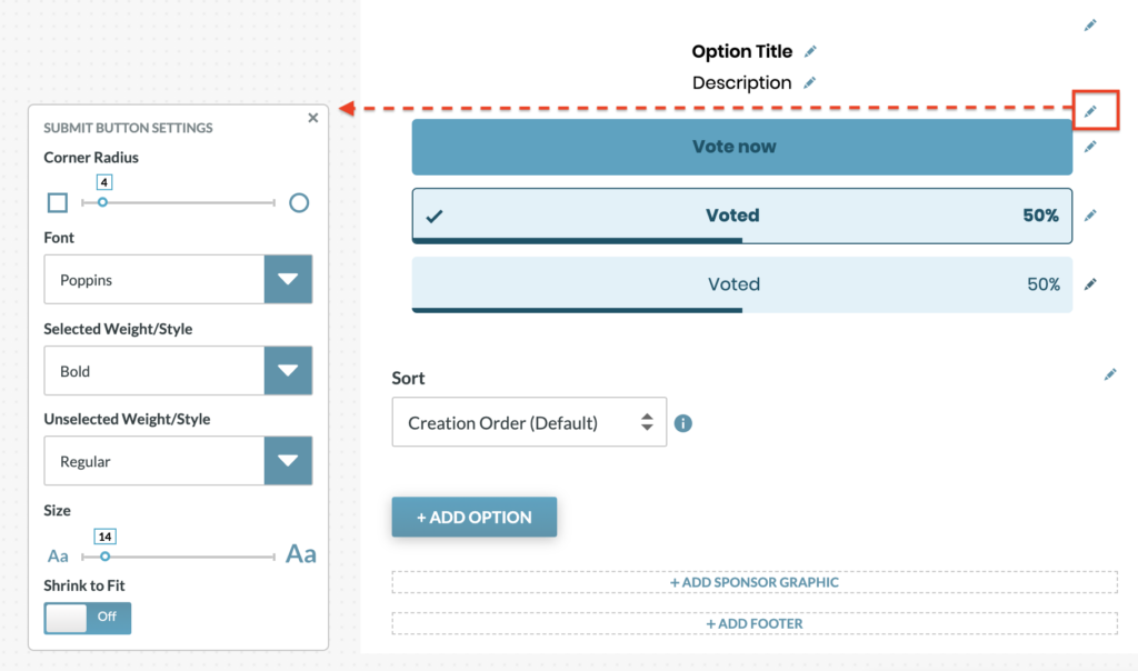
- Submit Button Settings (pencil icon):
- Configure Corner Radius – adjust the corners from square to round
- Font – applies to all button states
- Selected Weight/Style – applies to text on the button for the “Vote” state and the “Selected” state
- Unselected Weight/Style – applies to text on the button for the “Unselected” state
- Size – applies to all button states
- Shrink to Fit (This shrinks long text automatically to fit on button)
- Alignment
- Button (pencil icon): This applies to buttons for the “Vote” state
- Edit text/copy on button.
- Choose colors for button, text, border, including hover states for each, and select border size.
- Selected (pencil icon): This applies to the button for the “Selected” state.
- Edit text/copy on button.
- Choose colors for button background, text, icon, border and % bar.
- Upload custom icon. Image must be a 72x72px PNG file
- Select border size
- Unselected (pencil icon): This styling applies to buttons for the “Unselected” state.
- Edit text/copy on button.
- Choose colors for button background, text, icon, border and % bar.
- Upload custom icon (default is a checkmark). Icon image must be 72x72px PNG file
- Select border size
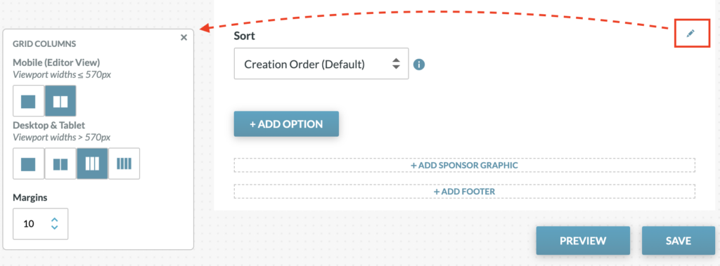
- Grid Columns (pencil icon): Configure the layout for how many vote options will be displayed on the same line.
- Sort (dropdown menu): Choose the order in which Options will appear on screen
- Creation Order (Default)
- Alphabetical by Option Title
- Randomized (options will appear in random order each time app is loaded)
- Custom (Use the left and right arrow buttons to arrange the order)
- +ADD OPTION (see “Create Options” details below)
- Add Sponsor Graphic: Sponsor image/link can be added at the bottom of the poll.
Create Options
“Options” are the selections/answers that the end user will be able to vote on. To create an Option, click on the “+ADD OPTION” Button. Then configure the Option by entering content for the following:

+ADD OPTION:
- Reporting Label (pencil icon) – This is the label that will appear in the Analytics chart. If nothing is entered here, this field will default to the text in the “Enter Option” field.
- Add Media – Upload image or add a YouTube video embed
- Enter Option – Enter the title for the Option (Example: Name)
- Description – This can be anything to further describe the Option (Example: Hometown, Team Name, etc.)
- Vote Button Text – This may be used to override the text copy on the Buttons. The default applies the same text copy to all Options for each button state (Example: “Vote now” for all the Vote Buttons). This setting allows you to override the default and enter button text for each individual Option (Example: “Vote for Mark” for one Option and “Vote for Lisa” for another Option). This text can be customized for each of the three button states:
- Vote Button Text – before the user votes
- Vote Button Text (Selected) –after the user votes, for the Option the voter selected
- Vote Button Text (Unselected) – after the user votes, for the Option(s) the voter did not select