
The Theme tab includes a majority of the campaign styles settings for the Rankify. Theme settings are broken down into the following sections:
- Fonts
- Color Palettes
- Element Colors
- Color Scheme
- Sizes
Fonts
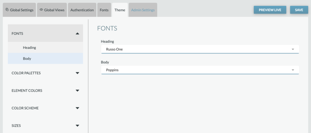
Heading: Select the font family desired for all heading copy throughout the application (e.g., Open Snapshot header, Thank You modal header)
Text: Select the font family desired for all text copy throughout the application (e.g., descriptions)
Reminder: Custom fonts can be added from the Fonts tab. Once added, they’ll appear as options within these dropdowns.
Color Palettes

The Color Palettes sub-tab includes the Custom color values for the Rankify application. Each color can be set by clicking the dropdown selection next to the color. The value corresponds with specific elements within the Rankify application.
Element Colors
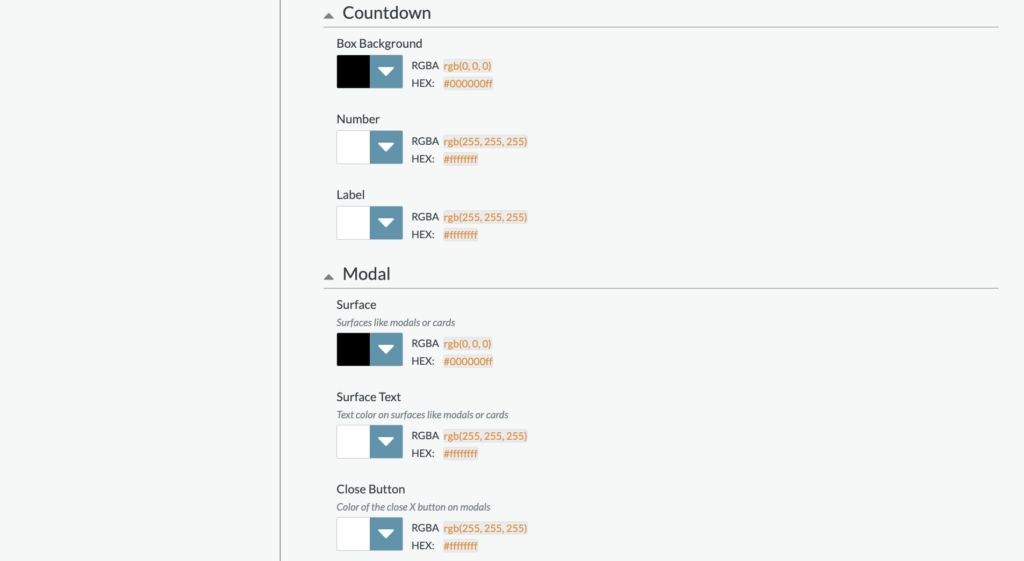
Element Colors sub-tab includes settings for elements that may require specific colors outside the color palette.

App Background: Sets the main app background across the Rankify application
Body Text: Sets the default app text color, including:
- Headline text color
- Description text color
Placeholder Text: Colors used for any placeholder text within the product.
Focus: The color of the outline displayed when an interactive element is focused. Accessibility feature.
Borders: Sets the default color for borders, including:
- Mobile/Tablet
Countdown Clock
- Box Background
- Number
- Label
Modal
- Surface: Sets the color for surfaces like modals or cards, including:
- Sign in/Sign Up modal background
- Sign in/Sign up modal headline, input label, email login headline
- Thank you modal headline
- Thank you modal share CTA
- Close Button
Color Scheme
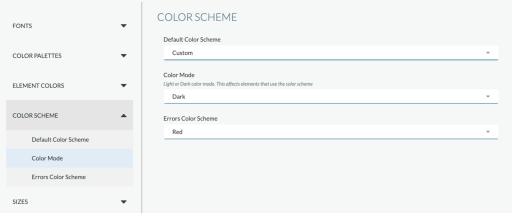
The Color Scheme default is set to the “Custom” color scheme, which includes the colors identified within the Color Palettes’ sub-tab. If desired, the color scheme can be adjusted to a preset color scheme. Preset color schemes include:
- Black
- Blue
- Cyan
- Gray
- Green
- Purple
When a color scheme other than Custom is selected, the scheme will override colors selected within the Color Palettes sub-tab.
Sizes
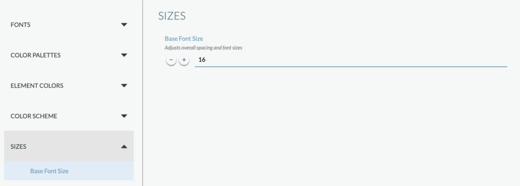
Set the base font size (based on mobile).