
This tab includes settings that will affect some styles, features that are in every snapshot:
Sitewide

Sitewide, background styles will allow you to set how the background appears throughout the campaign.
- Background Image: This is an image uploader field that will let you upload images from your device. Images should not exceed 100kb. If an image is uploaded, the app will use the image for the background and not the color set below.
- Background Color: This is a hex color picker field that will let you enter a hex color or drag your cursor until you find the hex color you are looking for. You will also be able to set opacity. Your RGBA and HEX values will display next to the color picker once chosen.
- If no image is uploaded above, the color will display as the background and the settings below will not be used.
- If an image is added but not set to cover, the color will display behind the background image.
- Background Size: Applies to the background image when used and allows you to choose from:
- Auto: This will set the background image to its natural size. It will not be scaled.
- Contain: This will set the background image to contain to either the full height or width, depending on whichever the image reaches first.
- Cover: This will stretch your image to fill the entire size of the application
- Background Repeat: Applies to the background image when used and allows you to choose from:
- No Repeat: This will not repeat your background image
- Tile: This will tile your background image to repeat in the size you chose
- Repeat Horizontally: This will place your image across the screen from left to right in your size choice
- Repeat Vertically: This will place your image across your screen from top to bottom in your size choice
- Background Position: Applies to the background image when used and allows you to choose from:
- Top Left: Your image will be placed in the top left of the screen
- Top Center: Your image will be placed in the top center of the screen
- Top Right: Your image will be placed in the top right of the screen
- Center Left: This will place your image in the middle of the page on the left hand side
- Center Center: This will place your image in the middle of the page
- Center Right: This will place your image in the middle of the page on the right hand side
- Bottom Left: Your image will be placed in the bottom left of the screen
- Bottom Center: Your image will be placed in the bottom center of the screen
- Bottom Right: Your image will be placed in the bottom right of the screen
Login/Logout
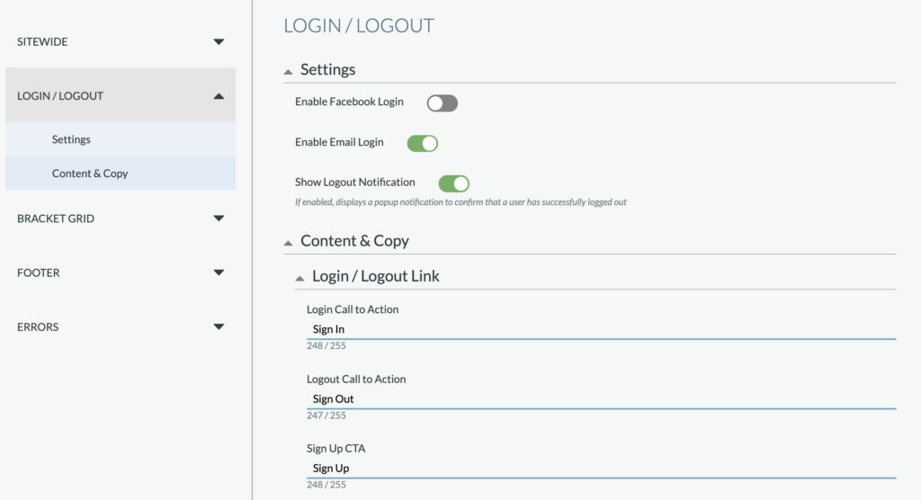
Enable Facebook Login: This field will allow you to choose if you want the users to login via Facebook
- If toggled on, users can login with Facebook and if toggled off, the user will only be able to login with email and email will be required to be on.
- Facebook App ID will be required: Please reference how to create a Facebook App ID here.
- Request user email from Facebook: When Facebook login is enabled, we use a user’s Facebook ID as the unique identifier. If you would like to collect a user’s email address, you can toggle this setting to on that will request access to a user’s email address upon login or registration (e.g., you’d like the email address for opt-ins, sweepstakes, etc.)
Enable Email Login: This field will allow you to choose if you want the users to login via email and is toggled on by default.
- If toggled on, users can login with email and if toggled off, users will only be able to login with Facebook and Facebook login will be required to be on.
Show Logout Notification: If enabled, displays a popup notification to confirm that a user has successfully logged out. This is toggled on by default.
Login/Logout Link :
- Call to Action: This is a text field that will allow you to direct the user to log in, log out, and sign up for the application. This lives under the header on the right hand side.
Login Modal: This includes the copy that a user will see when they have clicked to sign in. You’ll set the copy for the modal’s headline, required fields label, sign-in options label, link to registration, email login headline, the divider text, and the email/Facebook buttons.
Optins:
This is an array that allows you to add multiple opt-ins by clicking the Add Opt In link on the right hand side.
- You will need to click Add Opt-In for each field you want to add.
- You can manually or alphabetically sort the fields by choosing the sorting method under “Opt-In” in the CMS.
This is a multi field array that requires you to put:
- Type: Identifies the type and how this will be stored within reporting, choose from legal or opt in (2 max each).
- Legal: should be used for acceptance of legal requirements such as Terms and Conditions, Privacy Policy, Official Rules, etc.
- Opt-in: should be used for things like newsletters, marketing materials, etc.
- Label: This will be the copy for the opt-in on the UI.
- Error Message: if this is a required field and a user doesn’t check it this copy will show up underneath the opt-in.
- Required: this is a toggle, if on, the user must click it to proceed in the vote. If off, it is optional for the user.
- Pre-checked: this is a toggle, if on, the opt-in will be pre-checked for the user. If off, the user will have to check it.
Once you add an optin, you’ll see additional options on the left of each link which includes the ability to adjust the optin order with the up/down arrow icons, duplicate an optin, and delete an optin.
Sort: Use the dropdown to set how your opt-in links are sorted. Options include manual (uses the order of how the links are added within these Campaign Settings) or alphanumerically (ascending or dissenting).
Email Input: This is the field where the user will enter their email address on the login modal. This is a multi field section that requires:
- Placeholder: the copy that goes in the text field to explain to the user what they are providing
- Label: this will live above the field noting what it is.
- Required: this is a toggle, if on, the user must click it to proceed in the vote. If off, it is
- Error Message: if this is a required field and a user doesn’t complete it this copy will show up underneath the opt-in
- Validation: this should only be touched by a developer and should not be shown to a client
Registration Modal: Similarly to the login modal, this includes the copy that a user will see when they have clicked to sign up. You’ll set the copy for the modal’s headline, required fields label, sign-in options label, link to registration, email login headline, the divider text, and the email/Facebook buttons. Additionally, this is where you’ll set the fields optins that will be collected from the registration modal.
Logout Notification: This is the copy for the optional modal that notifies a user that they have successfully logged out.
Bracket Grid
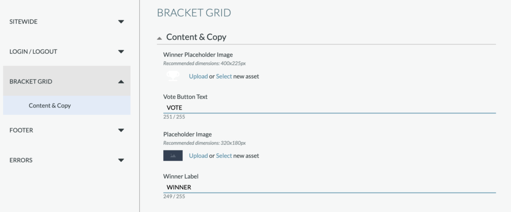
Winner Placeholder Image: This is the Image that is used in the center of the bracket, representating the “Winner” position in all rounds except for the Winner Round.
Vote Button Text: The text that will appear across the vote buttons (both on the grid and within the contestant modals).
Placeholder Image: Image used for default contestant images and all future round images. We recommend uploading a PNG asset that is a symbol or logo representative of the campaign or brand.
Footer
Settings
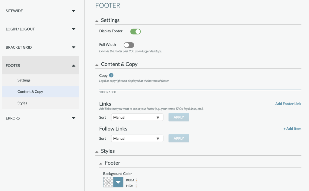
- Display Footer: Controls if the campaign has a footer. If toggled on, this will display the footer in the app and if toggled off, the footer will not be displayed in the app and there will not be a footer.
- Full Width: Allows you to choose if the background of your footer extends past 980px on larger devices. If toggled on, this will extend the background of the footer past 980px on larger devices and if toggled off, the footer width will be a max of 980px on larger devices. Note: This should match your header width settings for consistency.
Content & Copy
- Copy: Legal or copyright text displayed at the bottom of footer.
- Utilize basic syntax markdown for additional styles or symbols. For example, to add the copyright symbol to the text field here, use “©” where “Copyright © 2023” will display as “Copyright © 2023”
- Links: You have the ability to add up to 10 footer links, setting the link copy and URL for each one. Once you add a link, you’ll see additional options on the left of each link which includes the ability to adjust the link’s order with the up/down arrow icons, duplicate a link, and delete a link.
- Sort: Use the dropdown to set how your footer links are sorted. Options include manual (uses the order of how the links are added within these Campaign Settings) or alphanumerically (ascending or dissenting).
Styles
- Background color: This is a hex color picker field that will let you enter a hex color or drag your cursor until you find the hex color you are looking for. You will also be able to set opacity. Your RGBA and HEX values will display next to the color picker once chosen.
- Follow icons: The footer social icon color scheme is independent from the footer link & text settings that can be set by the app color theme under the Theme Tab, however the “Custom” follow icon theme setting will use the Default Color Scheme from Theme tab when selected.
Errors
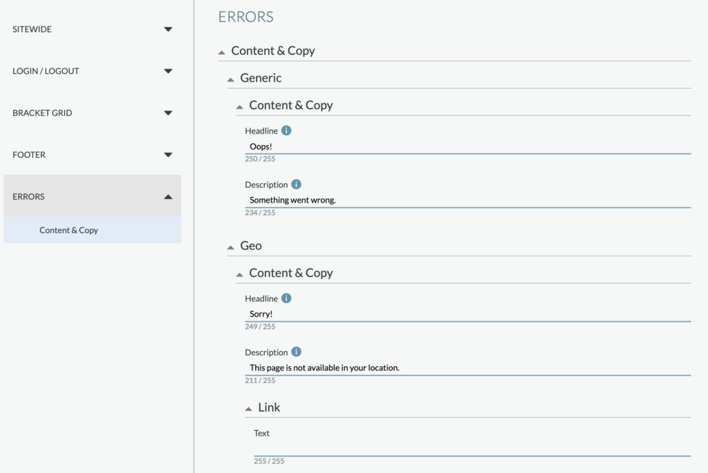
This section will let you set the error copy for your campaign. All errors appear within modals and some include buttons or links.
Please note that default copy has be pre-loaded within all of these error messages to minimize adjustments needed.
- Generic: This includes two text fields that will allow you to set the copy for the Headline and Description when a generic error happens
- Geo: This includes two text fields that will allow you to set the copy for the Headline and Description when a user is not in the specified geo location for this app. You also can include a link within this error modal.
- Overlimit: This is two text fields that will allow you to set the copy for the Headline and Description when a user has cast all their votes for that voting window.
- Window: This is two text fields that will allow you to set the copy for the Headline and Description when the application’s voting window has closed. This could occur when someone is on the site and the round snapshot has been set to inactive, but a user attempts to vote at the same time.
- Facebook Permissions: This is two text fields that will allow you to set the copy for the Headline and Description when a user chooses to not share specific necessary permissions with the app when logging in with Facebook. This error modal also includes a button that when clicked attempts the login process again with the user’s new permissions settings.
- Facebook Generic: This is two text fields that will allow you to set the copy for the Headline and Description when Facebook is not providing the necessary information needed for the user to continue. This error modal also includes a button that when clicked attempts the login process again.
- Apple Private Relay: This is two text fields that will allow you to set the copy for the Headline and Description when a user has Apple Private Relay enabled on their device. You also can include a link within this error modal; we recommend directing them to the Apple Support page to learn how to turn this off.