
The Theme tab includes all styles settings for the Bracket Vote campaign. Theme settings are broken down into the following sections:
Fonts

Heading: Select the font family desired for all heading copy throughout the application (e.g., Open Snapshot header, Thank You modal header)
Text: Select the font family desired for all text copy throughout the application (e.g., descriptions)
Reminder: Custom fonts can be added from the Fonts tab.
Color Palettes

The Color Palettes sub-tab includes the Custom color values for the Bracket Vote application. Each color can be set by clicking the dropdown selection next to the color. The value corresponds with specific elements within the Bracket Vote application. See below the guide for which elements are set by values within the Custom Color Palette:
| Custom Color Palette Value | Sets the following elements: |
| 50 | Mobile/Tablet navigation arrows (< / >) hover using the 500 color Sign out button background hover color |
| 100 | Mobile/Tablet click navigation arrows (< / >) Click on Sign Out button background |
| 200 | Unassigned – may be used in future updates |
| 300 | Hover color for links, modal navigation arrows using the 500 color Winner page Hero section |
| 400 | Unassigned – may be used in future updates |
| 500 | See Below under “Elements using the 500 color value” |
| 600 | Hover color for buttons using the 500 color Border and text color of “Sign Out” button |
| 700 | Processing/on click color for buttons using 500 color Click on back to top arrow & outline |
| 800 | To be used for dark mode, once support is added |
| 900 | To be used for dark mode, once support is added |
Elements using the 500 color value:
- Sign in button color/ Sign up button text color
- Sign up button hover color (inverts text/background color on hover)
- Log out confirmation pop up modal
- Submit Bracket button color
- Vote Again button color on bracket view
- Footer Link color, divider pipes and Copyright text
- Footer Social Follow Icons (when set as “Custom Theme” from the Footer Follow Icons Color Scheme)
- Sign In Modal “Sign In with Email” button, “Don’t have an account” text link
- Sign Up Modal “Continue” button, “Already have an account” text link.
- You are already signed up. Click here to sign in text/link.
- Contestant Modal
- External Link
- < / > nav arrows and modal close [X]
- Thank you Modal
- Check icon check mark
- View my Votes button background
- Mobile/Tablet: selected Nav Item and nav arrows and line below selected nav item
- Back to Top arrow and outline (not background)
| Default Text Color | Set to White except when using Cyan or Yellow Themes, then text color default is Black |
| Open/Closed Snapshots | Sign out button text and outline color |
| Open Snapshot | Vote again button text |
Element Colors
Element Colors sub-tab includes settings for elements that may require specific colors outside the color palette.

Body Background: Sets the main app background across the Bracket Vote application
Body Text: Sets the default app text color, including:
- Headline text color
- Description text color
- Total selections tracker text color (e.g., 0/8 selected)
- Mobile & Tablet Nav (non-selected round)
- Vote percentages on bracket grid
- Quadrant titles on bracket grid
- Placeholder Text: color of form input placeholder text
Borders: Sets the default color for borders, including:
- Mobile/Tablet: line below navigation labels (non-selected round)
- Sign In/Sign Up modal: border around email text entry field and divider line between Facebook button and sign up with email section (when FB login is enabled)
Focus: The color of the outline displayed when an interactive element is focused. Accessibility feature.
Back to Top Navigation Background: sets the background color only (the arrow icon will always be white)

All Vote Button styles are controlled from within this sub-tab, including:
- Vote button background
- Vote button background (checked)
- Vote button text
- Vote button text (hover)
- Vote button text (active)
- Vote button background (hover)
- Vote button background (active)
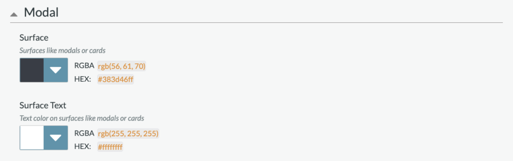
Specific surface colors within modals are set from this sub-tab.
Surface: Sets the color for surfaces like modals or cards, including:
- Sign in/Sign Up modal background
- Nominee modal background
Surface Text: Sets the text color on surfaces like modals or cards, including:
- Nominee name/description on nom modal
- Sign in/Sign up modal headline, input label, email login headline
- Thank you modal headline
- Thank you modal share CTA
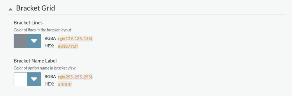
Bracket Grid colors set here include:
- Bracket Lines: the colors of lines in the bracket layout
- Bracket Name Label: the color of option name in the bracket grid view
Color Scheme

The Color Scheme default is set to the “Custom” color scheme, which includes the colors identified within the Color Palettes’ sub-tab. If desired, the color scheme can be adjusted to a preset color scheme. Preset color schemes include:
- Black
- Blue
- Cyan
- Gray
- Green
- Purple
When a color scheme other than Custom is selected, the scheme will override colors selected within the Color Palettes sub-tab.